

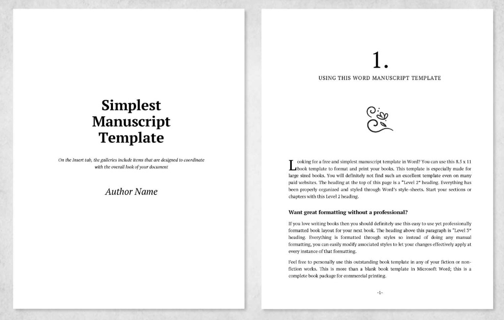
When submitting a novel, memoir, or short story to a literary agent or publishing house, your words matter, but how those words look on the page dictates whether they get read at all. Manuscript formats exist for one primary reason: legibility.
Editors and agents sift through thousands of pages annually. A clean, uniform manuscript allows them to focus entirely on your story and narrative voice without fighting erratic fonts, bizarre alignments, or crowded text. Mastery of these rules demonstrates that you respect the industry and understand the trade as a writing professional.
Typography and Layout Elements
Before writing a single sentence, your document must meet strict industrial structural standards regarding font choice, line spacing, paragraphing and page layout.
- Font: Use a plain, professional serif font, most commonly 12-point Times New Roman. While other fonts like Courier New or Arial are sometimes accepted, Times New Roman is the universal standard for traditional publishing. Avoid decorative script or modern sans-serif fonts unless explicitly requested.
- Spacing: Every line in the body of your manuscript must be double-spaced. Never use single-space or 1.5 spacing. The extra vertical room was historically used by editors to write handwritten notes and corrections. Today, it provides visual breathing room that reduces eye strain.
- Margins: Maintain uniform 1-inch margins on all four sides (top, bottom, left, and right). Do not shrink margins to artificially shorten page counts or expand them to make a short story look longer.
- Alignment: Text must be left-aligned, leaving the right margin ragged. Never use full justification, as it creates uneven word spacing that disrupts readability.
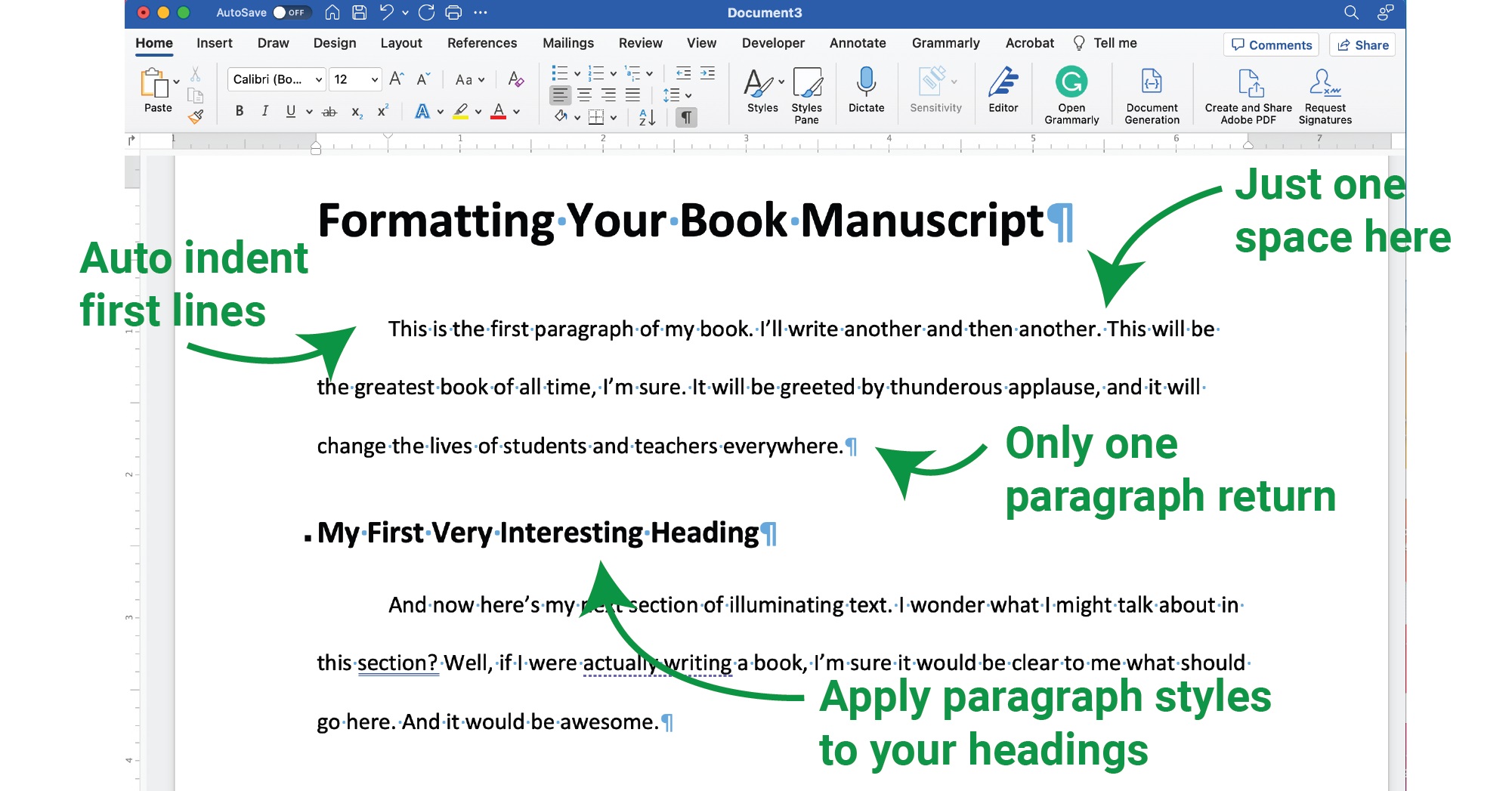
- Paragraph Indentation: Indent the first line of every new paragraph by 0.5 inches. Never use the spacebar or tab key manually to start a new paragraph. Configure your word processor’s paragraph settings to handle this automatically. Do not leave blank lines between standard paragraphs.
- Blank spaces: When your manuscript is completed, you must check that there are no leading blank spaces at start of a paragraph/new sentence line. Use your word processor’s ‘caret’ (¶) symbol to highlight all formatting elements.
Navigating Headers and Page Numbers
A proper header ensures that if a printed manuscript is accidentally dropped or separated, it can be reassembled instantly.
The Running Header
Except for the first page, every page should feature a running header positioned in the upper right-hand corner. This header typically contains your last name, a slash or space, a shortened version of your title, and the page number (e.g., AuthorLastName / Title / 4).
How to Implement It
- Use your word processor’s built-in header function.
- Check the box for “Different First Page” so that the running header does not crowd your title page or the opening page of a story.
- Never hardcode page numbers by typing them manually into the body of your text. Always use the automatic page-numbering tool.
The Title Page and Opening Pages
How you begin a novel manuscript differs slightly from how you begin a short story.
For a Novel Manuscript
A full-length book requires a formal title page.
- Contact Information: In the upper left-hand corner, single-space your legal name, address, phone number, and email address.
- Word Count: In the upper right-hand corner, list your approximate word count, rounded to the nearest thousand (e.g., Approx. 85,000 words).
- Title and Byline: Approximately one-third to halfway down the page, center your book’s title in bold or capital letters, followed by a “by” and your pen name or legal name on the next line.
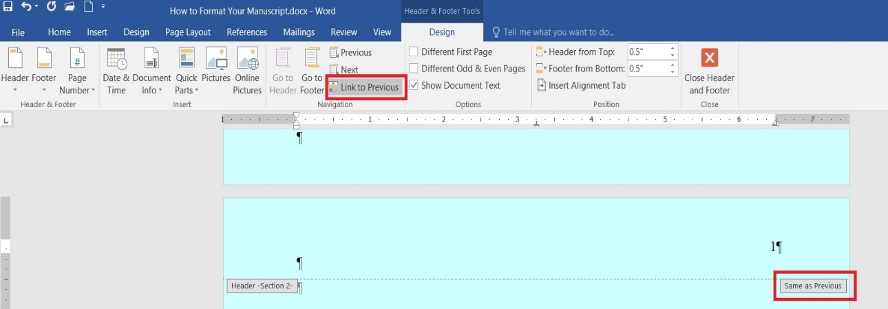
- Section Break: Insert a section break immediately after the title page, as the title page should not be numbered. In Word, this is done using the Page Layout/Breaks option.
- Body of manuscript: Chapter One should always begin at the top of a fresh page as page 1. Insert your page numbers in top right corner.
Then tick the ‘Link to Previous’ option to unlink/decouple the following numbered pages from the title page.
Format a Full-Bleed Manuscript
A book that has full-page pictures/images—there are no blank margins—is called full-bleed, and requires specific formatting to be properly printed.
Click on this article for instructions: https://www.stefanvucak.com/publishing-your-book-with-full-bleed-made-easy/
For a Short Story Manuscript
Short stories typically do not require a separate title page. Instead, place your contact details in the top left corner of page one, your word count in the top right, and center your story’s title one-third of the way down the page, followed immediately by the text after a few line breaks.
Some literary agents/publishers, short story magazines require that a manuscript is numbered. Some do not.
Special Formatting Conventions
Certain stylistic elements require distinct handling within standard manuscript guidelines.
Dialogue
Each speaker should start at their own new line. Whenever dialogue changes speakers, start a new paragraph and indent. Dialogue tags (he said, she whispered) should be kept natural, and punctuation should always sit inside the quotation marks.
Scene Breaks
When transitioning to a new scene or time jump within a chapter, do not leave massive vertical gaps. Instead, insert a blank line and center a visual marker—such as a single hashmark (#) or three asterisks (* * *)—on its own line.
Italics and Underlining
In the typewriter era, underlining indicated words that should be typeset in italics. In modern digital publishing, use actual italics for emphasis, internal monologues, or foreign words. Never use bolding for emphasis within narrative text, and avoid underlining entirely.
Sentence Spacing
Typewriter habits die hard, but the rule for modern manuscripts is strictly one space after a period, colon, or question mark, rather than the old double-space convention.
Submitting Your Work
When your manuscript is fully polished and formatted, you are ready to send it off! ALWAYS check the publisher’s requirements before submitting.
Self-publishing
If you are self-publishing your novel as an ebook or a print version, you need a different formatting approach. For ebooks, follow the Amazon’s formatting guide:
https://kdp.amazon.com/en_US/help/topic/G200645680
The most popular font to use for an ebook is 11 or 12 pt Georgia, as this font readily adapts to various viewing devices. Once your ebook is formatted, the file can be used to submit to various publishing platforms.
An ebook does not have a header or footer because the pages are virtual, ie: page size will be different dependent on the reading device.
Guidelines for Ebook Format:
- Reflowable Structure: Avoid trying to force a fixed layout. Elements like hard page breaks mid-chapter, manual line breaks, or complex text boxes will break a page or look distorted on various screens.
- Headings and Styles: Use built-in word processor styles (Heading 1, Heading 2) for your chapters and section headers. Ebook conversion software uses these tags to automatically build a functional Table of Contents (TOC), necessary for a KDP ebook.
- Images: Center all images and ensure they have descriptive alternative text. Avoid text-wrapping around images, as mobile screen sizes vary wildly, causing wrapped text to display unpredictably.
- Hyperlinks: Ensure external links (to your website, newsletter, or social media) are active and formatted cleanly. For internal links—such as footnotes or table of contents entries—use bookmarks and hyperlinks so readers can easily jump back and forth.
- Clean Styling: Strip out fancy decorations, custom drop caps, or unusual text colors. Let the user’s reading device handle text display defaults.
Caution: Be very wary using KDP’s Kindle Create option to format your manuscript. It often does not produce what you expect.
Guidelines for Print Format:
Unlike an ebook, a print book has a fixed layout. What you see on page 56 of your PDF proof is precisely what the reader will hold in their hands. Print design mimics traditional typography rules to create a polished, professional reading experience.
- Trim Size: Choose your physical book size before doing any layout work. Common sizes include 5” × 8” or 5.5” × 8.5” for fiction, and 6” × 9” for non-fiction.
- Margins and Gutter: Print books require asymmetrical margins. Because pages are bound together, the inner margin (called the gutter) must be wider to prevent text from disappearing into the spine.
- Outer Margin: ~0.5 to 0.75 inches.
- Top/Bottom Margins: ~0.75 to 1 inch.
- Gutter: Extra 0.25 to 0.5 inches depending on page count.
- Mirror Margins: Enable “Mirror Margins” in your word processor or layout software so that left-hand (verso) and right-hand (recto) pages mirror each other correctly.
- Full Justification: Unlike manuscripts, print books use fully justified text. This gives text blocks clean, sharp rectangles on both sides, mimicking traditional publishing standards. Make sure to turn on automatic hyphenation to prevent huge spaces between words.
- Fonts and Typography: Select a traditional serif font for the body text (such as Garamond, Caslon, or Minion Pro) sized between 10-point and 12-point with roughly 120% to 130% line spacing (leading). Serif fonts are much easier to read in print blocks than sans-serif fonts.
- Front and Back Matter: Organize your book into the proper traditional anatomy:
- Front Matter: Half-title page, title page, copyright page, dedication, table of contents, and acknowledgments. Each typically starts on a right-hand (odd-numbered) page.
- Body Matter: Chapters 1 onward.
- Back Matter: About the author, author’s note, and teasers for other works.
- Running Heads and Footers: Place the book title on the left-hand running header and the author name or chapter title on the right-hand running header. Page numbers should sit centered in the footer or alternate to the outside edges.
While you can use advanced Microsoft Word templates or Apple Pages, professional indie authors often use software like Adobe InDesign, Affinity Publisher, or free tools like Vellum (Mac) and Atticus (PC/Mac) to generate print-ready interior PDFs seamlessly.
Once the manuscript is formatted, create a PDF file for submission to KDP, Draft2Digital, or IngramSpark.
For more articles on writing, formatting, publishing, and marketing, click on my Blog.